I'll warn you right now: this post contains a Downton Abbey spoiler. That makes sense on an art ed blog, right? Okay then.
We have close to three cycles under our belts, but only my youngest students have completed their initial projects. (I see my classes just once every 6 days, for 45 minutes apiece.) I'm hoping to get a few of those project posts completed in the coming days, but if you're like me, you love a good preview (or a preview that's way too fast and leaves you hanging and questioning WHY MATTHEW HAD TO DIE!?). So here are some candids from the first few days of art class, showing what the little artists are working on for their Square 1 Art projects!
Before she left us, my student teacher had the fourth graders whip through a quick two-day drawing/oil pastel resist/creepy eyeball extravaganza. Both Miss Caruso and I have a thing for drawing eyes, and I doubt we're alone. Something about the details, the symbolism, and the uniqueness of eyes is really quite captivating.
Granted, for all their beauty, there is something about touching my own eyes twice a day--contact lens wearers, high five!--that is absolutely disgusting, and when we have children, my husband will be responsible for any and all child eye problems, but whatever. They're fun to draw!
After a bit o' sketching, Miss Caruso had the kids draw final copies on small (6 x 9") white paper. Kiddos could choose a human eye or an animal eye.
Oil pastels were used to color, leaving any to-be-black spaces uncolored, while white spaces must be colored with white oil pastel.
India ink was smeared across part of or the entire paper and left to dry.
And as part of our last class together, the kiddos used large popsicle sticks to scratch away as much of the India ink as desired/possible.
Some of these look SUPER neato, while others just didn't quite get there (my own example was part of the latter group!). But the kids were really into it and had some good drawing exposure. And now they have some creepy eyeballs to scare their parents with! Win!
I had this post all ready to go yesterday but for whatever reason could not publish it. Yesterday was that kind of day, it seemed. I blame my three-day weekend, which was so fabulous that my normally super fun blessing of a job is just paling in comparison. Home improvement, dining out, visits from family, yard sales, and the full first season of Downton Abbey do a wonderful weekend make. (Ohhhhmagoodness totally hooked on Downton, by the by. I might have start a new blog dedicated to my newfound love for it. Keep your eyes peeled for that mess.)
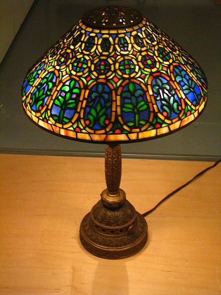
But alas, here we are, and I do have a great new project to share! I first found the idea here on ArtMuse67, a sweet blog to which you should probably devote your planning period (or evening... whilst watching Downton... duh).
We did our lamps a little differently, as I didn't have myself a stack of acetate. Instead, I raided my pantry for tin foil, on which my husband recently stocked up because he's an amateur extreme couponer and got it for 19 cents a roll. I love him.
To begin, kiddos studied photos of Tiffany lamps, pointing out their similarities and characteristics. Some of the boys did the "this is girly" boy-whine, but were quickly schooled on the fact that Louis Comfort Tiffany was a man, and a very successful and wealthy man at that!
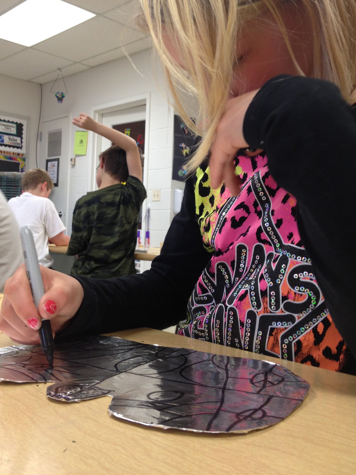
Then, everyone cut a symmetrical lampshade-ish shape from a piece of oak tag. Sharp and pointed edges were to be avoided as much as possible to prevent the soon-to-be-added foil from ripping. For the rest of class, kiddos worked on sketching a design for their shade.
On the second day, everyone covered their shade with glue stick glue, followed by foil, which was wrapped around the edges and secured on the back with masking tape.
Then came Sharpie Palooza 2013! After designs were re-drawn on the foil shades with black Sharpie, students were allowed to choose up to four colors to use for filling in the blanks.
When the shade was complete, it was time to cut a bilaterally symmetrical black lampstand. A few kiddos even added a little pull chain! Some kids finished this in three 45-minute classes, while others needed some extra time. But the wait was worth it--check these out!
As students finished up, I showed this clip from "Antiques Roadshow:"
How precious are those ladies! God bless 'em. I hope my mama has a Tiffany lamp hidden from me somewhere.
Anyway, my super student teacher taught this project from start to finish and I was completely jealous the entire time. I may or may not have made multiple examples while the kids worked 'cause it's just that much fun! Judging by the results, I think the fourth graders agreed:
Now if you'll excuse me, I have some fictional WW1-era characters to think about projects to grade.
After spending 6 or 7 classes on the Chinese Dragon Puppets, my fourth graders needed a quickie project to hold their attention and get another piece of finished work on the walls. These Asian Banners fit the bill quite nicely!
Here's the skinny on these skinny projects (har har). Kiddos grabbed a long, narrow sheet of paper and folded it accordion-style.
This year, I splurged on Dippity Dye paper.* At one building, we used liquid watercolor (slightly
diluted with tap water), which gave us 6 color options; the other
building used homemade liquid watercolors made from dried-out markers
soaked in water. The homemade colors were far superior!
The accordion, still folded, got double-dipped into a set of analogous colors.
Papers were unfolded and laid out to dry till next time.
On the second day, we watched the following video:
Then, everyone fashioned a hanging thingamajig (quality vocab, check) for their banner. A slip knot wedged between some scrap black paper did the trick, as I didn't have enough wooden dowels, chopsticks, or some facsimile thereof and didn't care to mess with them anyway.
Students chose several Chinese characters to paint onto their banners in a vertical arrangement. (You could use any Asian language, of course; I opted for Chinese, as I have several students of Chinese descent.) I had one of my buildings use true India Ink, while the other used black tempera. While the India ink soaked into the Dippity Dye paper very quickly and therefore wasn't as easy to work with as the paint, I reeeeally prefer the look of the ink.
With black tempera
With India ink
Some of my kiddos opted to paint their names instead of a few random characters--I provided them with a website where they could look up their
names to print out and bring along for the second day, if they so desired.
These bright banners will look great hanging around the halls!
* Personally, I have mixed feelings about the Dippity Dye paper.
I found that thin, student-grade watercolor paper works just fine for
this particular project. That being said, the Dippity Dye paper is nice
and does a significantly better job of blending of colors and creating a tie-dye
effect. It's extremely thin, though, and therefore easily ripped. I'm curious about the name-brand Dippity Dye--I wonder if it could possibly blend and be any more brilliant than our homemade liquid watercolors.
P.S. I'm still looking for book recommendations to amp up the art room library! Please help!


