Wednesday, November 28, 2012

Cityscapes

Since I don't see kindergarteners, a lot of my first graders' art time is spent on the basics. Currently, we're working our way through types of art: portraits, landscapes, et cetera. This quickie cityscape project was a HUGE hit with the little stinkers. Thanks for the idea, Mr. E!

If I rushed the kids, I think I could fit the whole shebang into one 45-minute class. This time around, however, I did split the class into an intro/drawing/watercolor day, then a tempera day (with time leftover for something else).

To keep track of the different classes, I varied the paper sizes. My favorite was the long and low 6x12" size. The idea to make the paper this size and orientation totally came from one of the first graders--beaten at my own game, I am.

First, we looked at a few photos of cityscapes (thanks, Google), focusing on those with sunsets in the background and the city set in silhouette. Everyone drew their own interesting city line.


 Watercolors made the skies look lovely. Some sweeties did have some trouble with blending colors, so some of the skies resemble Fruit Stripe gum, but there's nothing wrong with a good food-related throwback.


On the second day, the kids watched in awe as I used a small flat brush to outline my city in black before filling in the white spaces. And I was pretty impressed with the way they maneuvered their own flat brushes!


My husband didn't believe me when I said that these were the work of first graders. I count that as a win!


Tuesday, November 27, 2012

I am thankful to be back with the kids (at least that's what I tell 'em)

I hope everyone had a very happy Thanksgiving and a wonderfully relaxing break! My family sojourned to our family cabin, which was built by my grandfather, and where my mom and her five siblings learned to fish, swim, and row a boat.


There was food, family (my husband's family joined us, which was so great), food, ooo-ing and ahh-ing over wedding and baby photos, more food, hiking, four-wheeling, and lots of food, too. Mostly carbs. Amen baby.

This was our first Thanksgiving as a married couple and it was fabulous. My husband's older sister, who has Down Syndrome, is the most popular person wherever she goes, and Thanksgiving was no exception. She wrote a poem (as she does for every special occasion), which she read for all of us as we sat in our pumpkin pie comas.


My aunt, mother-in-law, and sister-in-law blazin' a trail!

Today is our first day back and it is snowing for the first time this year in our part of Pennsylvania. It's quite beautiful--though an early dismissal would make it much more so!


Saturday, November 17, 2012

28 years ago, an art teacher was born (hehe)

Earlier this week, I celebrated my 28th birthday. I know that some people don't like working on their birthday, but I really enjoy it. Hanging out with a few hundred kiddos on one's special day is pretty special in itself.

Last weekend, as a little pre-bday getaway, my husband took me to Inner Harbor in Baltimore, Maryland, about 1.5 hours away. We stayed in a nice hotel where we ordered some great Chinese food, vegged out, and slept in--no puppy wake-up call at 6:30 (!!!), 'cause he stayed with a friend.

Starbucks and cold Chinese--breakfast of champions!

The day was spent wandering and shopping the Harbor, and enjoying a great seafood meal by the water. Then we went to IKEA! 'Twas a good day!


One of the highlights of my actual birthday came when I first arrived at school, where two of my fifth graders (twin girls) presented me with a painting that one of them had done and framed:


I don't think I can put into words how touched I was. The little sweetie said, "I used the watercolor techniques that you taught us." LOVE

Later, my best friend, who teaches second grade, brought some coffee and a pumpkin muffin for me for breakfast--super yum! And it just so happened that the PTO had organized a thank-you luncheon for teachers on that very day--excellent timing! That evening, my husband and I joined our best friends and their precious infant son to go out to a really nice dinner. It was a wonderful meal (I had lobster, mmmm), and thanks to a restaurant contest I won last year, we had enough gift card credit to pay for everything! Nothing says happy birthday like a day of free meals!

The next day I was at my other building, where a fourth grader had left me a stuffed dachshund puppy and a homemade card. A fourth grade boy. Precious.

Twenty-seven was a good year. I married my best bud, adopted a sweet puppy, and bought a house. And of course, I started this blog. ;-)

Any good birthday memories to share?

Thursday, November 15, 2012

Value painting: finishing up

One of the third grade classes just finished their value paintings and I wanted to share the results!

As a refresher, this project began when I saw a Pinterest pin that led nowhere.


I decided to have the kiddos do their pencil and glue lines on black paper instead of white. Then, we painted each leaf a different color, including various tints and shades within each color.


When the paint was dry, we cut around the contour of the leaves. And then I was stuck! I flat-out told the kids that I wasn't sure how I intended to have them finish their projects. Together we looked at some options and decided to mount the leaves onto a colored sheet of paper. Even with the bright fadeless color options, something was missing. Finally, we went with the following: a 10x16" piece of colored paper mounted onto a 12x18" black piece, with the leaves on top.

(Disclaimer: My iPhone and art room lighting don't do the bright colors justice, and I intentionally over-cropped the bottoms to cut off student names.)


This is a light blue background--silly phone.


What a difference a little black frame can make! The kids were so pleased with their paintings, and for winging it, I was, too. From start to finish, this took us four 45-minute class periods, with a little time leftover on the last day.

I really like the black lines between the leaves, though I know that the black paper did affect the way the tints went on. Thoughts?

Displaying Dubuffet sculptures

Just a little update on the Jean Dubuffet project that I first showed you here on Monday. When I had a chance to display these sculptures, my brain said, "oh, these are sculptures, so they should sit on a table or other such flat surface." So I thought about getting an extra table or two from the custodian. Then I came to my senses and thought, "silly brain! Sculptures don't have to sit on a table or a pedestal! You are a ridiculous little brain." And then I hung 'em on the wall!


I loooove the way the sculptures pop off of the wall, giving our hallways some oomph! I did hang them on the hallway closest to my room, so I can keep an eye on kiddos as they pass by them, as they are fairly delicate, being made of paper.

I don't know if anyone else at school or in blogworld cares for this project, but I do a happy little dance when I see these hanging on the wall. More importantly, the kids loved it and the kids learned, so I'm a happy woman.

Monday, November 12, 2012

Jean Dubuffet Sculptures

For a few years, I've done an abstract project involving line, color, and sweet lil' second graders. Recently, I saw images of artwork by Jean Dubuffet that reminded me of said project. So this year, I've incorporated the two.

There are other Dubuffet lessons out there; I found the following before re-styling my own:

Dali's Moustache
Kids Artists
Hands, Head 'n Heart in the Artroom

Prior to seeing his work, I didn't know much about Dubuffet. If you're in the same boat, check out the following references that really helped me out:

Dubuffet.com
MoMA
Poul Webb Art Blog
Art Smarts 4 Kids

Here's what we did. First, we began by filling a 9x12" white piece of paper with a 'controlled scribble,' allowing our imaginations and our pencils dance around the page. The kids did this on both sides of the paper before consulting tablemates to choose their better side. Then, pencil lines were traced with a fine-tip black Sharpie. We erased any peek-a-boo pencil lines.


Kiddos colored a few spaces with the Sharpie, while other sections were filled with linear patterns using a white crayon.

Everyone's abstract shape was cut out.


Next art class, the watercolors came out and the artists went to work! Students were limited to two colors of their choice (like Dubuffet and his limited color palette). Some spaces were left white, while others got the bold color treatment.


When works were dry (within a few minutes), they were mounted onto paper. Glue stick glue was put on all edges of the pieces, but pushed down in select locations to create 3D sculptures, a la Dubuffet. They were THRILLED with their (simple) sculptures! And I have to say that I agree--the results are simple yet arresting.

Cutting a few of those black lines for more dimension


While we worked, we listened to a bit of music that Dubuffet had put together: http://www.ubu.com/sound/dubuffet.html The kids' reactions were quite entertaining!

This was a quick two-day project that gave us room to finish any previously incomplete projects (in this case, Gators), and fostered peer helping, as some kids 'got' it more than others. I look forward to finishing this project with my other second grade sweeties!

Thursday, November 8, 2012

Square 1 Art update

Earlier this week, all Square 1 Art artwork, order forms, and free stickers arrived back to us! I handed all packets back to teachers for distribution, but thought you might like a little peek of the artwork we sent away and had digitized. Please forgive the heinous quality of some of the pictures, which I took in a rush using my iPhone.

I went into all kindergarten classrooms to do a little project with them. We made handprint butterflies, which I didn't get a chance to photograph, but you can imagine how precious they are.

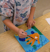
First graders stick with the handprint theme, turning a single print into a goldfish. It's a good intro to painting for first graders, since the paper is so small (less than 9" square).


I love me some Henri Matisse, and the second graders really love his cut-outs, which we mimic when we review organic and geometric shapes, as well as figure drawing, for these colorful, playful projects.


Previously, I discussed the third graders' Georgia O'Keeffe flower drawings here.


Fourth graders look at Picasso's Cubist period and use oil pastels to chop a leaf into 'pie pieces,' which they color with complementary and analogous colors.

Yes, this autumn-themed artwork was made by a girl named Autumn. Hehe.
And probably the most popular (and dare I say NO-FAIL!?) project is that of the fifth graders, which I call Henna Hands (totally incorrect, 'cause Henna is the plant, Mehndi is the process, but I like alliteration!). While it's probably one of the more abstract lessons in terms of concepts--what makes good design and layout, unity, balance, repetition, etc.--I've never had a bad result!


In years past, I had to collect all order forms and money, process it all, and whoa mama--that was lots of work. This year, Square 1 blessed art teachers everywhere by creating an online ordering process. YES! So, I'm thinking that the next steps will be simpler. Fingers crossed.

Do you do Square 1 Art? What projects do you do?

Wednesday, November 7, 2012

Aspen Trees

Like many new teachers, I inherited a classroom full of stuff when I took this position six years ago. Some of the stuff was junk: a box of sawdust... shoeboxes full of un-rubbery rubber bands, probably older than I... a dried out snakeskin (NOT okay for someone petrified of that which slithers)... a very real and living bat, hibernating amongst the boxes of yarn... yup.

Luckily, I inherited a lot of good things, too, including stacks of old Arts & Activities magazines. This lesson came from a back issue, and I found the lesson online in PDF! Get the PDF here! It was written by Elaine Canfield, so thanks to her, wherever she may be. While I modified it for my kiddos, the essentials are the same.

I do this project with my fifth graders as part of our painting unit.

We start out by discussing the natural beauty of the Aspen trees.

source: nationalgeographic.com
source: britannica.com

Then, I demonstrate the 'quick flick' technique used to make the black and white tree trunks. Essentially, you need a little black tempera in a styrofoam tray, some small scraps of cardboard, and some practice! I tell the kiddos that it's essential to line up each cardboard 'flick' with the next one in order to create the look of the straight lines that form the trees.

Students do a manilla practice version before their final copy on 12x18" white paper.


On the second day, we use the wet-on-wet technique to create the smooth, airy skies, and the dry brush technique to make tufts of grass.


Typically, we need a third day to do our leaves, for which we use little sea sponges and more tempera, this time in beautiful fall hues.

Where is this child's smock!? I fail.

This project also serves as a good discussion point for horizon line and perspective. The kids always 'ooo' and 'ahh' over their own multi-method results. Also, it gets a lot of compliments when hung in the hallways. And that just makes me look good (hehe).