I went into all kindergarten classrooms to do a little project with them. We made handprint butterflies, which I didn't get a chance to photograph, but you can imagine how precious they are.
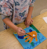
First graders stick with the handprint theme, turning a single print into a goldfish. It's a good intro to painting for first graders, since the paper is so small (less than 9" square).
I love me some Henri Matisse, and the second graders really love his cut-outs, which we mimic when we review organic and geometric shapes, as well as figure drawing, for these colorful, playful projects.
Previously, I discussed the third graders' Georgia O'Keeffe flower drawings here.
Fourth graders look at Picasso's Cubist period and use oil pastels to chop a leaf into 'pie pieces,' which they color with complementary and analogous colors.
 |
| Yes, this autumn-themed artwork was made by a girl named Autumn. Hehe. |
In years past, I had to collect all order forms and money, process it all, and whoa mama--that was lots of work. This year, Square 1 blessed art teachers everywhere by creating an online ordering process. YES! So, I'm thinking that the next steps will be simpler. Fingers crossed.
Do you do Square 1 Art? What projects do you do?


The lively Matisse cutouts look great! I really like the contrasting black figure over colorful, whimsical shapes with their name written so boldly.
ReplyDelete